Industria e Produzione: racconta la tua storia aziendale con un sito web chiaro e user friendly. Lasciati ispirare.
Zero Wind
Zero Wind: an innovative and quality production. As well as the site created according to their needs!
Ros
Avete mai navigato un sito web per tanto tempo senza mai stancarvi per quanto è bello? E vi è mai capitato con un sito B2B del settore metallurgico?
N0? Allora provate con il sito di Ros.
Marana Forni
Marana ovens stand out for their efficiency and design: hence the need to explain every aspect, while still managing to amaze. We have balanced these two needs by exploiting engaging mini-videos, few icons, and simple and intuitive renderings.
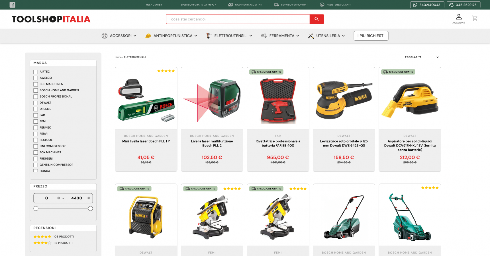
Toolshop Italia
An e-commerce with such a vast catalog requires clear ideas, an orderly structure and obsessive attention to usability. This is the essential content of our "toolbox".

Yunno
Yunno is an innovative benefit start-up that aims to improve the efficiency of processes and increase the productivity of the companies they target by taking care of the well-being of their employees. They asked us for an emotional look and we gave it... literally!
Manufactotum
Precision, beauty, and functionality: a custom-sculpted site by katana strokes.
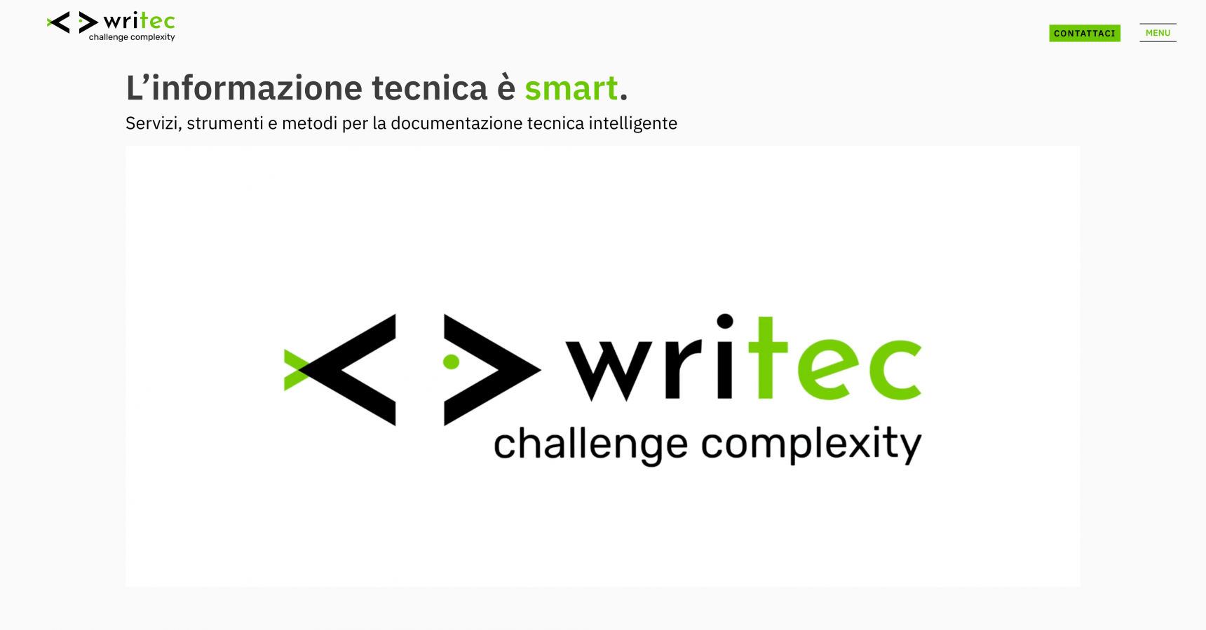
Writec
What do we have in common with Writec? What we call the 3 Cs: competency, customer care and clarity. 3 Cs that, on the site, jump out at you right from the homepage...

Mollificio Adige
In the foreground, the dynamism of an activity that has been going on for more than 65 years. Vital layout, in constant motion. In a nutshell: Mollificio Adige.
Framor Power
When logo and site are born together, the result can only be exciting. For Framor Power we have created a coherent and homogeneous visual identity, able to tell the story of the company and its personality.
Do you have an exciting project to discuss?
Contact us!