Il sito realizzato per Zerowind è in nomination su Awwwards
Clicca qui per scoprire di più e votarlo!
Zerowind produce tessuti altamente tecnici e innovativi, pensati per affrontare le sfide più estreme, come gli sport outdoor con condizioni meteo avverse e temperature rigide.
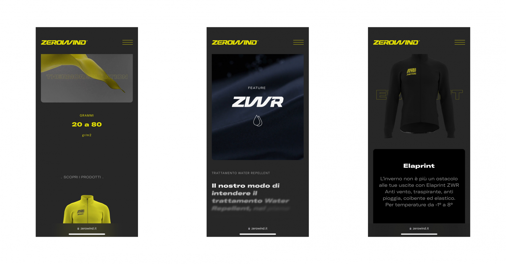
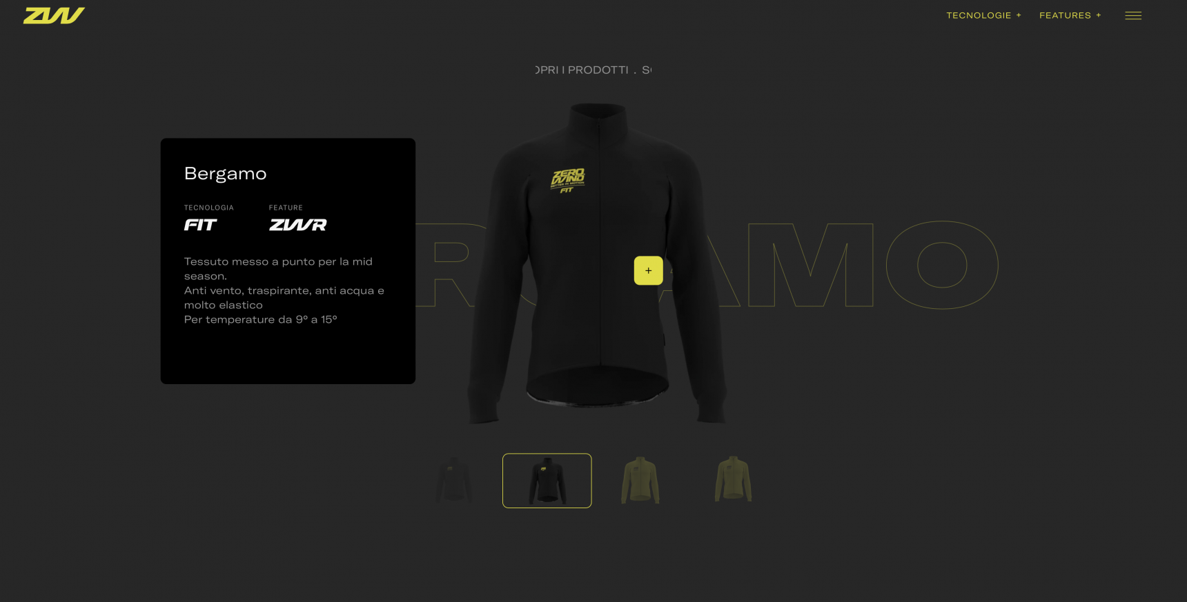
Per loro abbiamo realizzato un sito di alto profilo, integrando animazioni, responsive su misura, font e colori in grado di trasmettere l'essenza del brand. Il sito è in nomination sul prestigioso sito awwwards, gli Oscar del web.
Dynamic elements make a website responsive, but only if done well
Internally, we call the Zero Wind site a real "design jewel".
Indeed, it is so. But the truth is that its realization is the result of a collaboration that involved everyone in our team, from the creative team to the nerd developers that work behind the scenes (aka back-end).
It is clear that, in websites, there is a trend of animations and dynamic effects to give a touch of "innovation". However, the common mistake is that many of these sites are not designed with the real user experience in mind. What should be "cool" elements become real disturbing elements for the user, who is there to find information in a simple and direct way.
Website animations are a serious thing: they must make navigation easier, smooth and pleasant, not the other way around.
The result of this reflection is precisely the site of Zero Wind: a site that shines for its animations, organization of content and technical performance.

The mobile user experience: a navigation version designed separately
In the case of Zero Wind, we did not just optimize the site for mobile, but completely re-designed a new version specifically for smartphones and tablets.
The site, therefore, has two distinct variants: in fact, the focus on the mobile user experience was particularly high, Precisely because of the high dynamic and innovative content of the site and to maintain this balance between creativity and functionality even in a multi-channel perspective.

Managing the content of a website outside the box
Let us not forget that a website must be, first and foremost, a container of useful information for the user. In addition to aesthetics and functionality, the organization of content is crucial.
For this reason, the dynamic elements and transition effects have been designed to support a product management system developed entirely on customer’s specific requirements. The products are labelled according to their distinctive features, the blog is organised in a simple and intuitive way, and the content architecture has been designed to ensure easy and immediate use.
www.zerowind.it